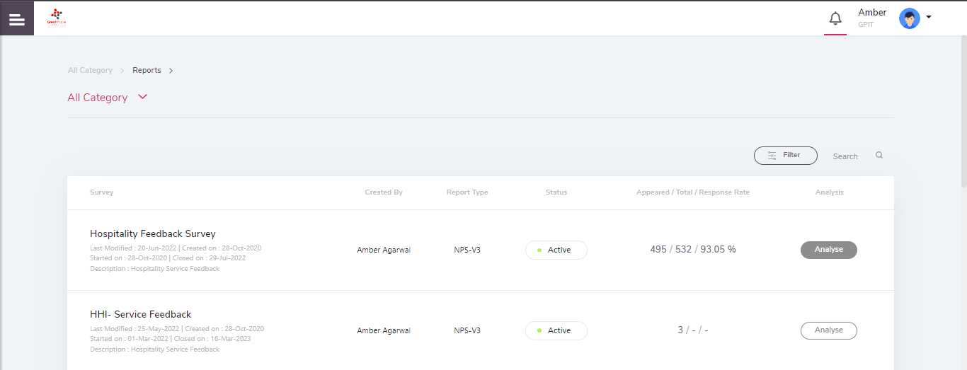
Users have a provision to analyse the survey data at different functional levels. To analyse a survey report, go to the list of surveys and select one to analyse. Click on the Analyse option. In this case, click on the NPS report type.
Once users select the analyse option, they will be directed to the Dashboard page of the reports or the Insights page.
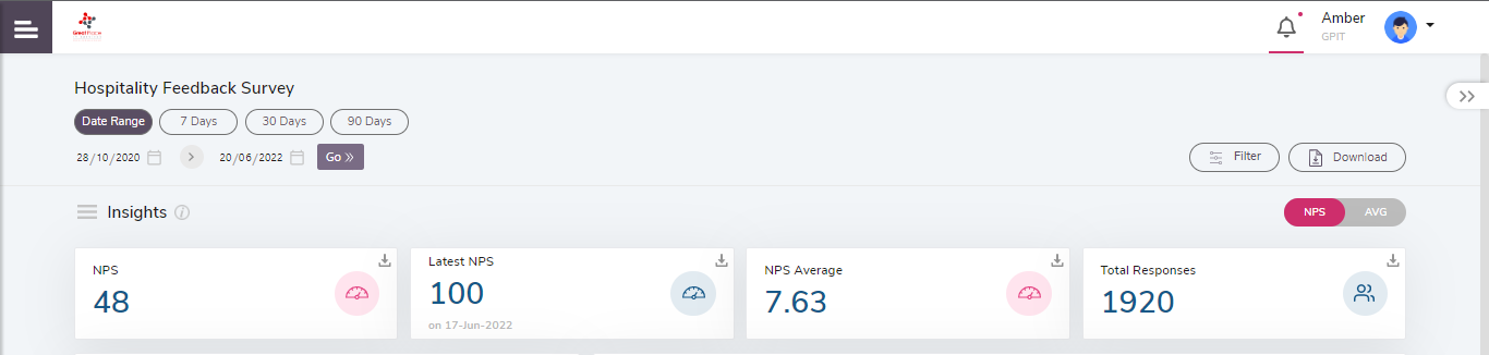
All the scores shown on the Dashboard page are specifically for the highlighted question. Filters can be applied by using the Filter Dropdown as well as by changing the dates.
- Scores can also be verified in terms of Overall and Average.
- Toggle switch to NPS or AVG as per the requirement.
- NPS indicates Overall scores based on the sum of all responses w.r.t total response.
- AVG indicates average scores considering only positive response i.e.4 & 5 in terms of NPS only.
- Total number of respondents will be the same for both NPS and AVG.
Users can also change the date (timeline) filter by selecting a specific timeline given as 7 days, 30 days, and 90 days. The Date Range allows the user to select a specific timeline and analyse the survey data as per the selected Date Range. The scores on the Insights page will change as per the selected Date Range.
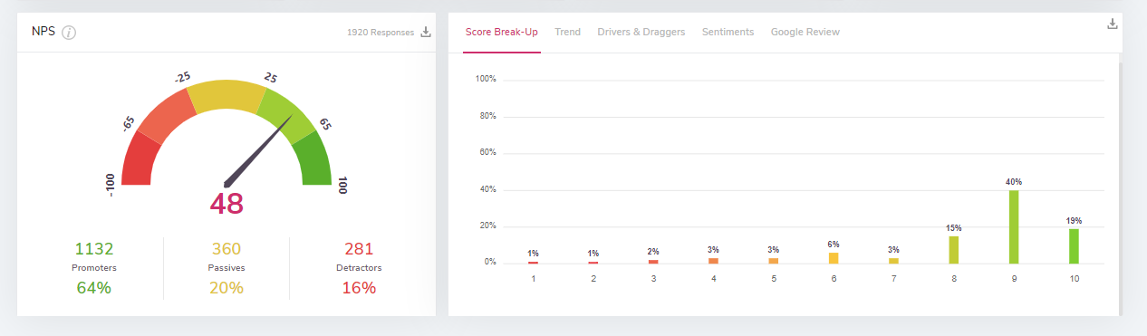
Score Break-Up:
The Score Break-up bar graph shows the number of respondents in a categorized format according to their responses. It displays the number of respondents as opposed to the scores they have given. To understand more about the calculation logic of the NPS, the user can click on the ‘i’ icon given to the right side of the NPS section.
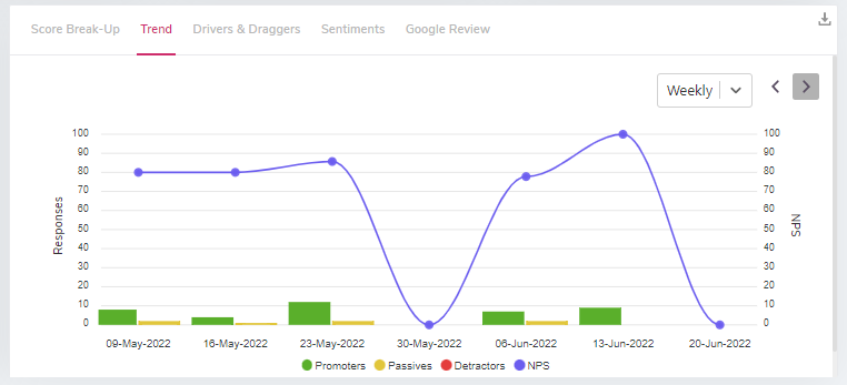
Trend:
The trend graph allows users to verify the participant responses. Users can change the timeline from the dropdown as per the view required. For e.g., if the daily filter is selected, the trend graph shows the distribution of Promoters, Passives, and Detractors count of each day. The blue line displays the overall NPS score. The date and the count of Promoters, Passives, and Detractors hover once the cursor is on a graph.
Note: The data is shown as per the selected timeline.
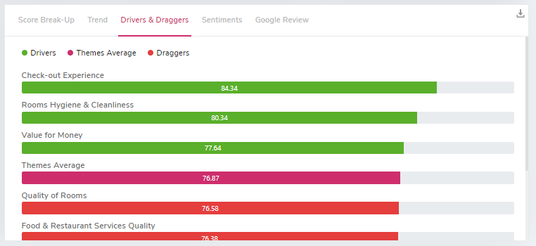
Drivers and Draggers:
Drivers and Draggers show the overall scores theme-wise. The date range (timeline) filter gets applied to Drivers & Draggers and accordingly the overall scores of the theme get changed. This gives a glimpse of the performance of the Themes present in the Survey.
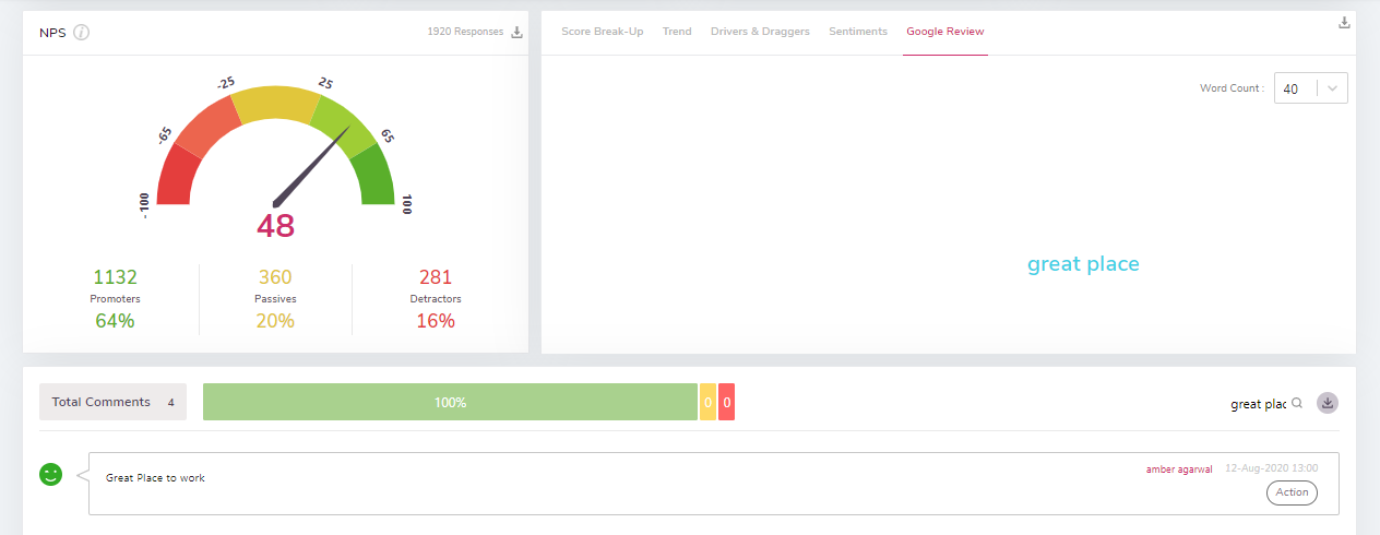
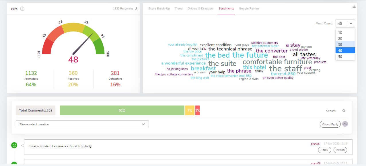
Sentiments:
The Sentiments section shows the total comments given by the respondents in the survey. Users can also change the word count from the dropdown. As per the selected count, the number of comments will display. The comments are divided into three categories Positive, Neutral, and Negative. Users can verify the comments by clicking on the desired sentiment. For e.g., if a user clicks on the green bar i.e., the positive bar, only the positive comments will be displayed below.
Google Place Id ( textual identifier that uniquely identifies a place), Google Review Pull Frequency(frequency in days to pull Google reviews) Once these are configured through settings and google review is enabled, users will be able to see google reviews for that particular place.